

 So how did you come to be part of the Magic Fish Dreaming team?
I met June Perkins through my involvement in the ABC Open Disaster Project. We kept in contact and she approached me about designing the layout for a children’s book she was working on.
What is your background in design? and can you tell us a little more about Heidi the person and artist
I graduated from Qld College of Art with a Bachelor of Visual Arts in Graphic Design in 1997 and have been working as a graphic designer in one form or another ever since. This is my first children’s book design however. I am also a freelance photographer, writer and I occasionally dabble in drawing. Before I became a designer I wanted to be a fine artist.
What did you find different about a children’s book compared to the previous work that you do?
I normally work on corporate material which does not always give the opportunity to be highly creative (except where I can sneak it in). However given that the text and illustrations themselves were so delightful it was not hard to let the creativity flow!
What inspired your decisions on the typography and layout for Magic Fish Dreaming?
Definitely the imagery and the words. I visualised each word as a playful, little picture and envisioned how it would bounce across the page, but not detract from the beauty of the illustrations.
I’ve always loved making text flow across curves and shapes so that it becomes an art piece in itself.
What is your favourite page of the book?
“Beyond Caterpillar Days,” with its combination of the beautiful artwork by Helene and poetry by June, is simply breathtaking.
What where some of the challenges of this book, and how did you overcome these?
I had to ditch some traditional corporate design rules (small typeface, clean, lots of white space) and consider a creative and child specific typographic layout so that the design made the text easier for young children to read.
I had to factor in font choice and size, colour, and page layout with regards to educational and age specific demands, and consider how all of it would work without taking away from the integrity of the illustrations and text.
Would you like to work on more children’s books? How can people get in touch with you?
Yes absolutely! I really enjoyed the experience.
People can get in contact via my WordPress site Heidi Den Ronden
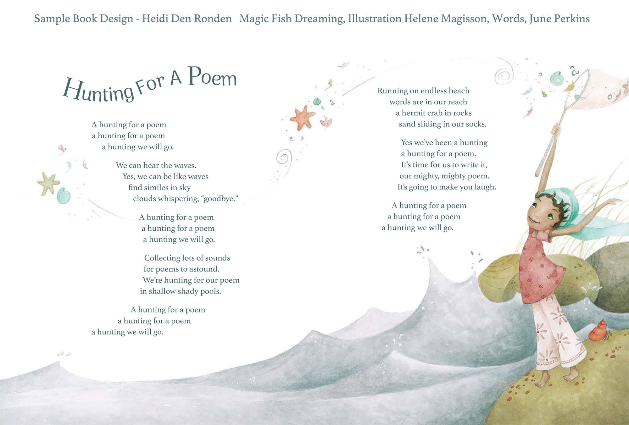
Above is a poem Helene and June shared for the kickstarter and how it changed with design.
Below are some of the layouts before it was designed.


POST SCRIPT
June said this about working with Heidi:
“Heidi Den Ronden was part of a dedicated and delightful team who worked together to produce Magic Fish Dreaming. Her playful designs enhanced the artistic work of Helene Magisson and showed sensitive understanding of my poetry.
Her professionalism and high level communication skills made working with her a rewarding and enriching experience for all in the team.”
Helene had this to say about working with Heidi on the book:
“It has been a great pleasure to work with Heidi on the poetry book Magic Fish Dreaming. She demonstrated an amazing imagination in her work. She was able to enhance each page thanks to her wonderful artistic sensitivity and always with a strong respect to the integrity of the illustrations. It was also very pleasant to communicate with her as she has wonderful and surprising ideas; she is open minded, flexible and available.
She gave a very special and unique touch to the book.”

Reblogged this on Pearlz Dreaming and commented:
Meet the Designer of Magic Fish Dreaming
LikeLike